Visit Wayne County Ohio Visual Identity
Branding for a Heartland Community with Heart
The visual identity for Wayne County centers on the concept of hometown pride. Nestled in northern Ohio, Wayne County combines the charm of a countryside dotted with rolling hills, red barns, and farmland with the vibrancy of a small city. Positioned near one of the largest Amish populations in the United States, it offers a unique blend of rural and urban character.
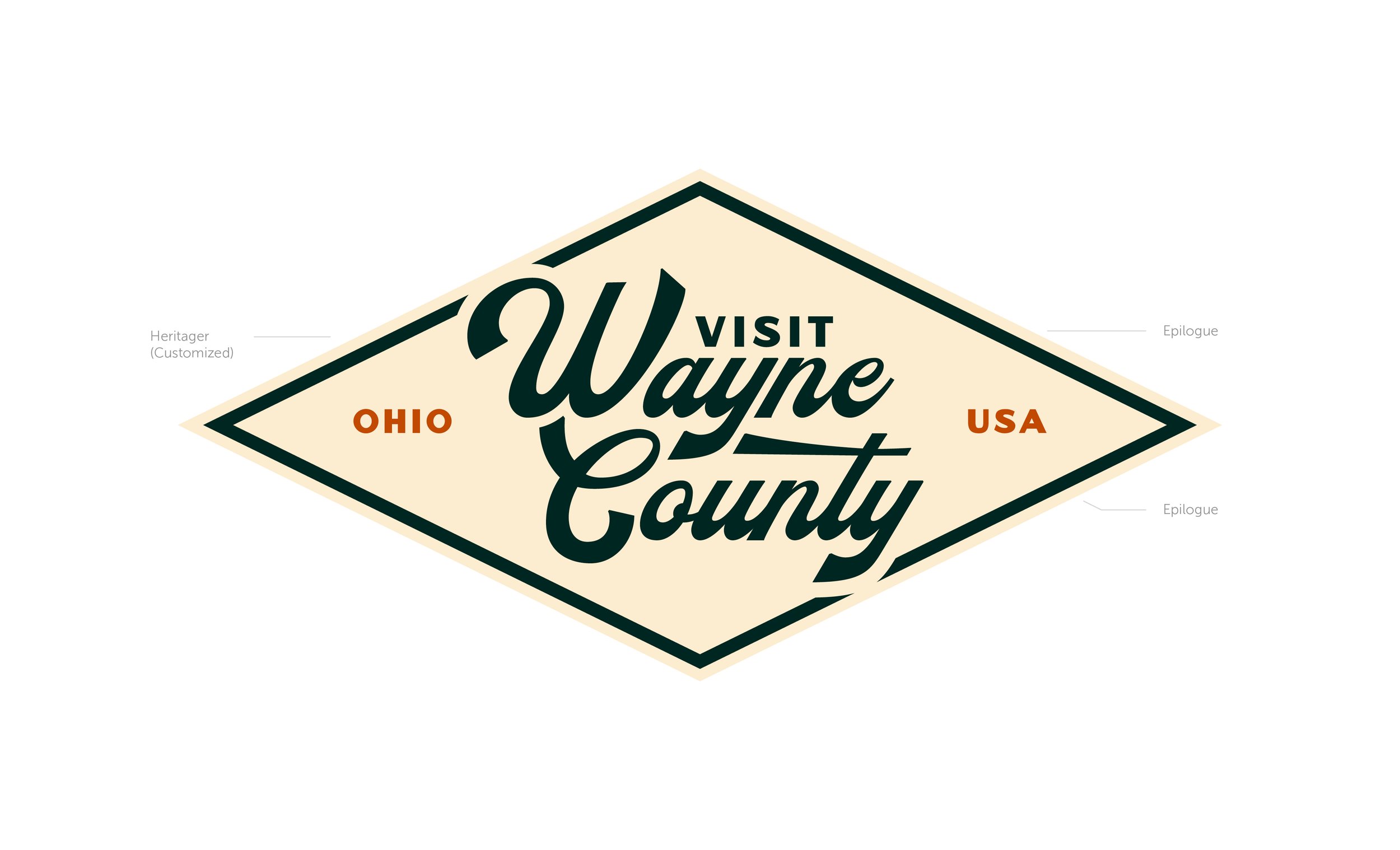
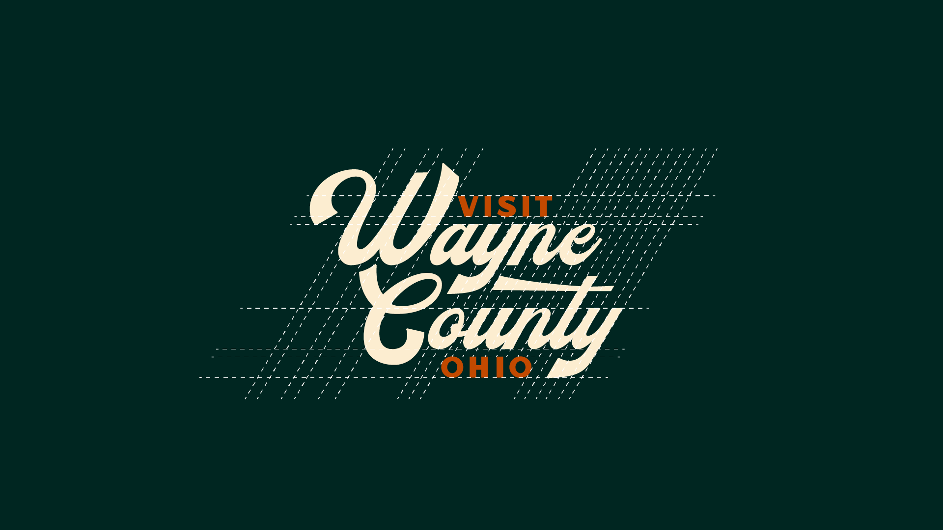
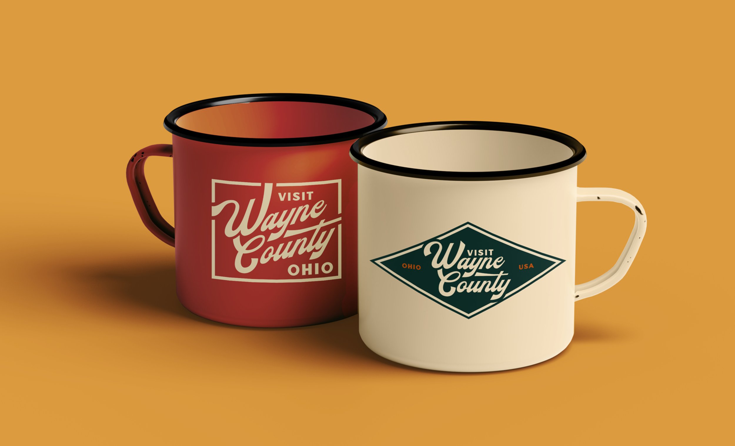
Above all, the county's greatest strength is its passionate and welcoming community, which serves as the heart of its identity. This translated into the visual styling of handmade furniture, utilizing simple but effective custom typography set into a badge system that is reminiscent of stamps used by furniture makers throughout history. This speaks to their welcoming and artistic community, their Amish neighbors, and literally to a stamp of pride to place on their county.
Agency
Simpleview
Role
Visual Identity Design & Mockup Conception
Scope
Visual Identity
Project Design Process
1 | On-Site Visit & In-Depth Discovery Process
Competitive & Regional Analysis
Defining the Personality, Attributes, & moodboarding for the visual identity
2 | Logo Suite Development
Development of a full logo suite, including a main logo that represents the client’s personality and attributes. In addition, regional logos were provided to celebrate the smaller communities within the county.
3 | Responsive Website Design
Strategically designed the website to align with key performance indicators, including visitors guide requests, highlighting blog content, and pointing visitors and residents to their events calendar.
Project Outcome
Both the brand and website were approved with no revisions. The client stated that we provided them with the “perfect logo”.

Regional & Competitor Analysis
Wayne County had a unique challenge of not being the sole Wayne County in the US. So in addition to doing a regional competitive analysis with nearby counties, I did a competitive analysis with counties with the same name.


Insights
Light & Bright, Wayne County’s logo is bogged down by complexities. It needs space to breathe, with lots of white space between colors
Interesting Typography, not many of the regional or competitive examples use unique typefaces, they mostly use a lot of san serif fonts
CTA in name, Explore, Visit, etc.
A unique color palette that stays away from blue as the primary color

Destination Personality
Cultured
Authentic
Family-Friendly
Natural
Creative
Welcoming
Industrious & Hardworking
Unassuming
Community-Oriented
Destination Attributes
Slower-paced
Vibrant
Idyllic
Multi-Faceted Modern & Traditional
Agritourism
Micropolitan
Peaceful