Visit Wayne County Ohio Strategy & Website
UX Design Rooted in Community Character
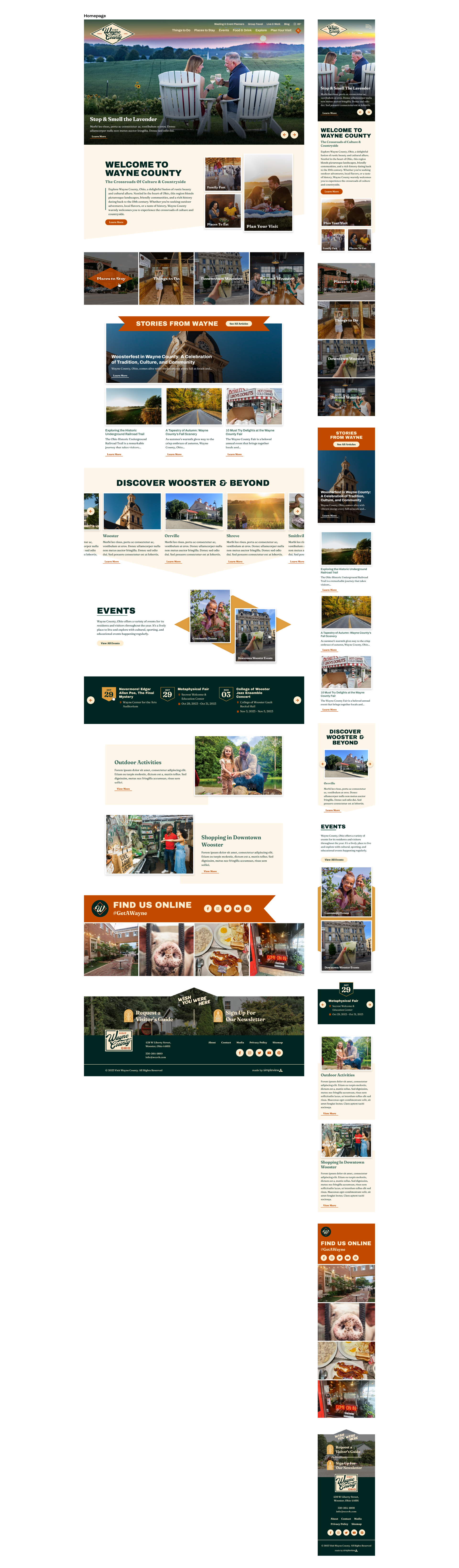
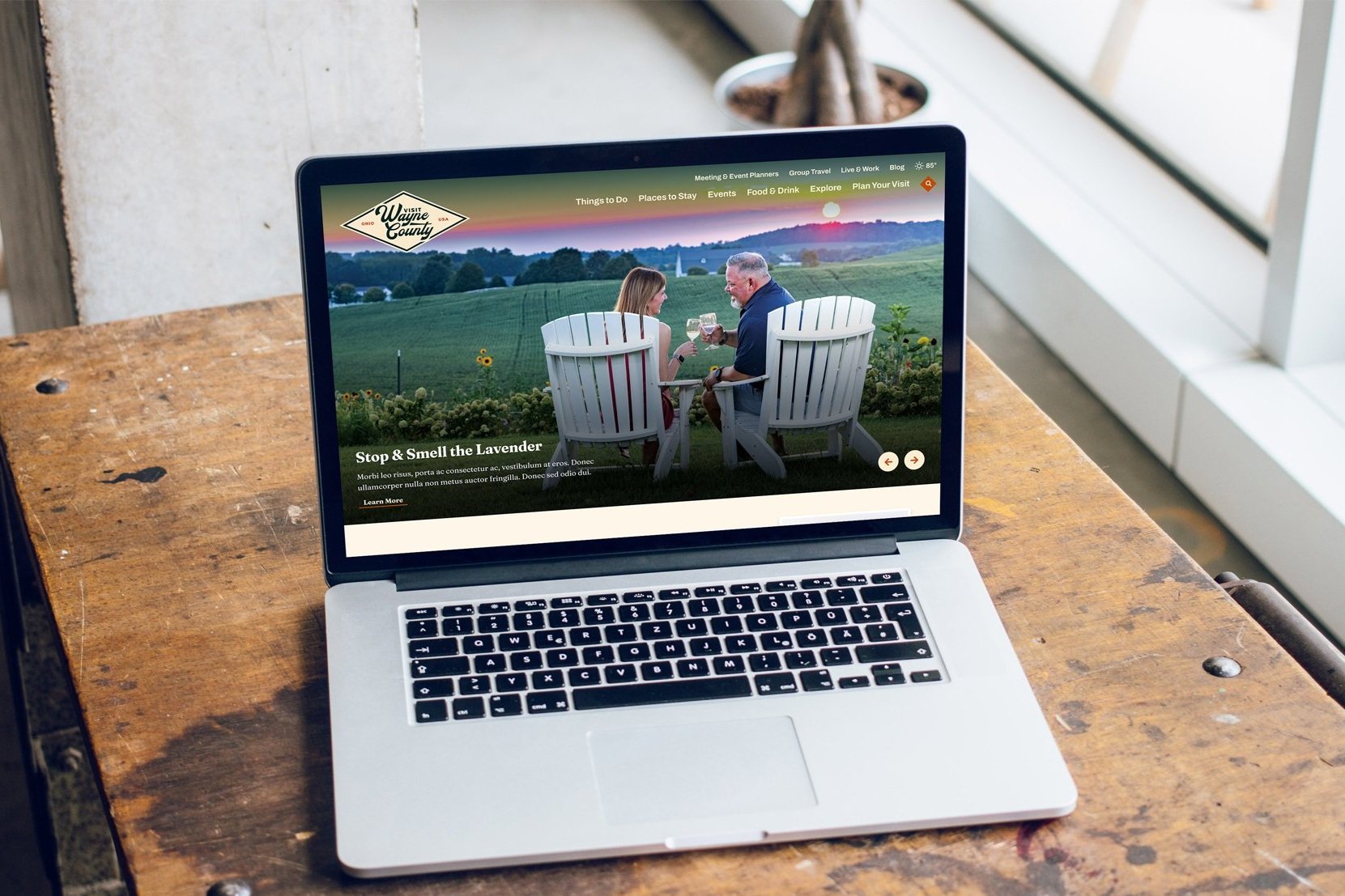
For the Wayne County website, the goal was to reflect the region’s rural-urban balance through an intentional user experience. The design approach emphasized the warmth of the community, which reflected the client’s specific KPIs of investing in their local partners. With a diverse audience that focused on long-time residents and tourists from a variety of drive markets, the user experience focused on accessibility, an intuitive navigation experience, and providing spaces for local storytelling.
Curious how this experience ties into the county’s handmade, pride-filled brand identity? Check out the visual identity project here.
Agency
Simpleview
Role
Visual Identity Design, UX Strategy, & Website Design
Scope
Visual Identity & Website Design
Design Process
1 | On-Site Visit & In-Depth Discovery Process
Competitive & Regional Analysis
Defining the Personality, Attributes, & moodboarding for the visual identity
2 | Logo Suite Development
Development of a full logo suite, including a main logo that represents the client’s personality and attributes. In addition, regional logos were provided to celebrate the smaller communities within the county.
3 | Responsive Website Design
Strategically designed the website to align with key performance indicators, including visitors guide requests, highlighting blog content, and pointing visitors and residents to their events calendar.
Project Goals
Supported the county’s economic development plan by emphasizing rural character, smart growth, and revitalized downtowns.
Focused on attracting young professionals and families by modernizing the user experience while preserving local heritage.
Improved Wayne County’s visibility as a destination through a website that feels both contemporary and true to the area’s roots.
Key Performance Indicators
Increased visitors guide requests by optimizing key conversion points throughout the site.
Highlighted blog content and event calendars to keep both residents and visitors engaged with local happenings.
Boosted member and partner referrals to directly support the local economy through better promotion of community businesses.
User Research Insights
Older visitors seek antiquing and Amish craftsmanship, often visiting for quiet, heritage-focused experiences.
Younger couples visit for events, wineries, and weekend getaways, suggesting a need for easy access to experiences and itineraries.
Identified emerging audiences in group tourism and the wedding market, drawn to Wayne County’s unique venues and scenic charm.

Destination Personality
Cultured
Authentic
Family-Friendly
Natural
Creative
Welcoming
Industrious & Hardworking
Unassuming
Community-Oriented
Destination Attributes
Slower-paced
Vibrant
Idyllic
Multi-Faceted Modern & Traditional
Agritourism
Micropolitan
Peaceful


TL;DR
Ensured the website would pass WCAG color compliance at at least a AA level
Colors represent their modern rural personality
Google Fonts were budget-conscious choices that balanced readability with personality.
Reusable UI components and branded diamond shapes brought consistency to the design.
Key content like the visitor’s guide, blog, and events were made highly accessible.
Local businesses and partnerships were prominently featured to support the community.
Color & Typography
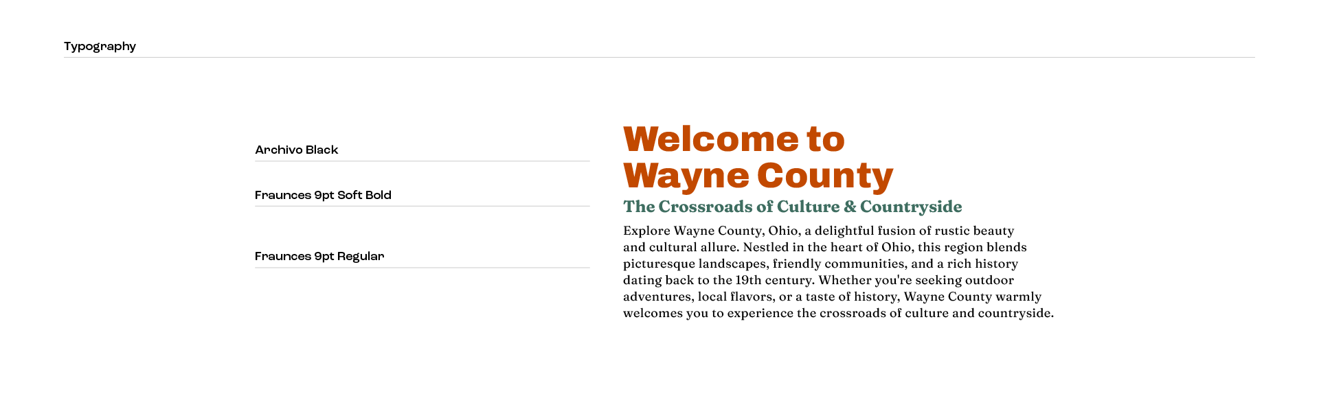
Because the website would follow immediately after the branding project, accessibility and visual consistency were considered from the start. I tested color choices for ADA compliance early on, ensuring the palette would work across digital and print platforms. The colors reflect the vibrant energy of downtown Wooster, balanced with earthy, grounded tones that represent Wayne County’s countryside. I also built out tints and shades of each color to create a versatile system usable across various brand touchpoints.
For typography, Archivo was chosen for its strength, clarity, and visual similarity to the primary brand typeface, making it highly legible across screen sizes. Fraunces adds a friendly, approachable feeling that softens Archivo and helps communicate the welcoming personality of the community.
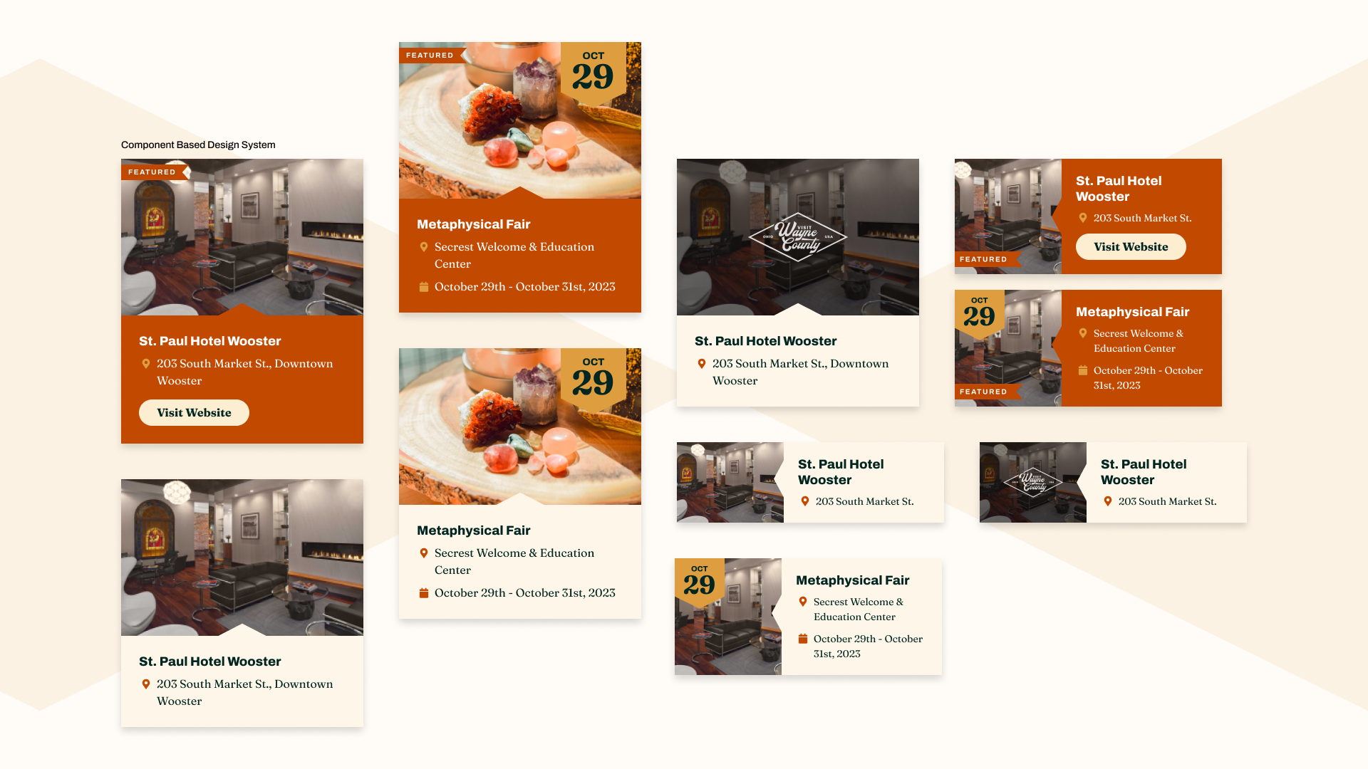
UI Elements & Information Hierarchy
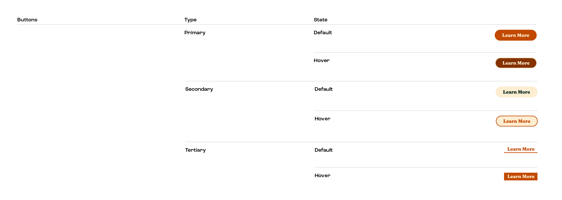
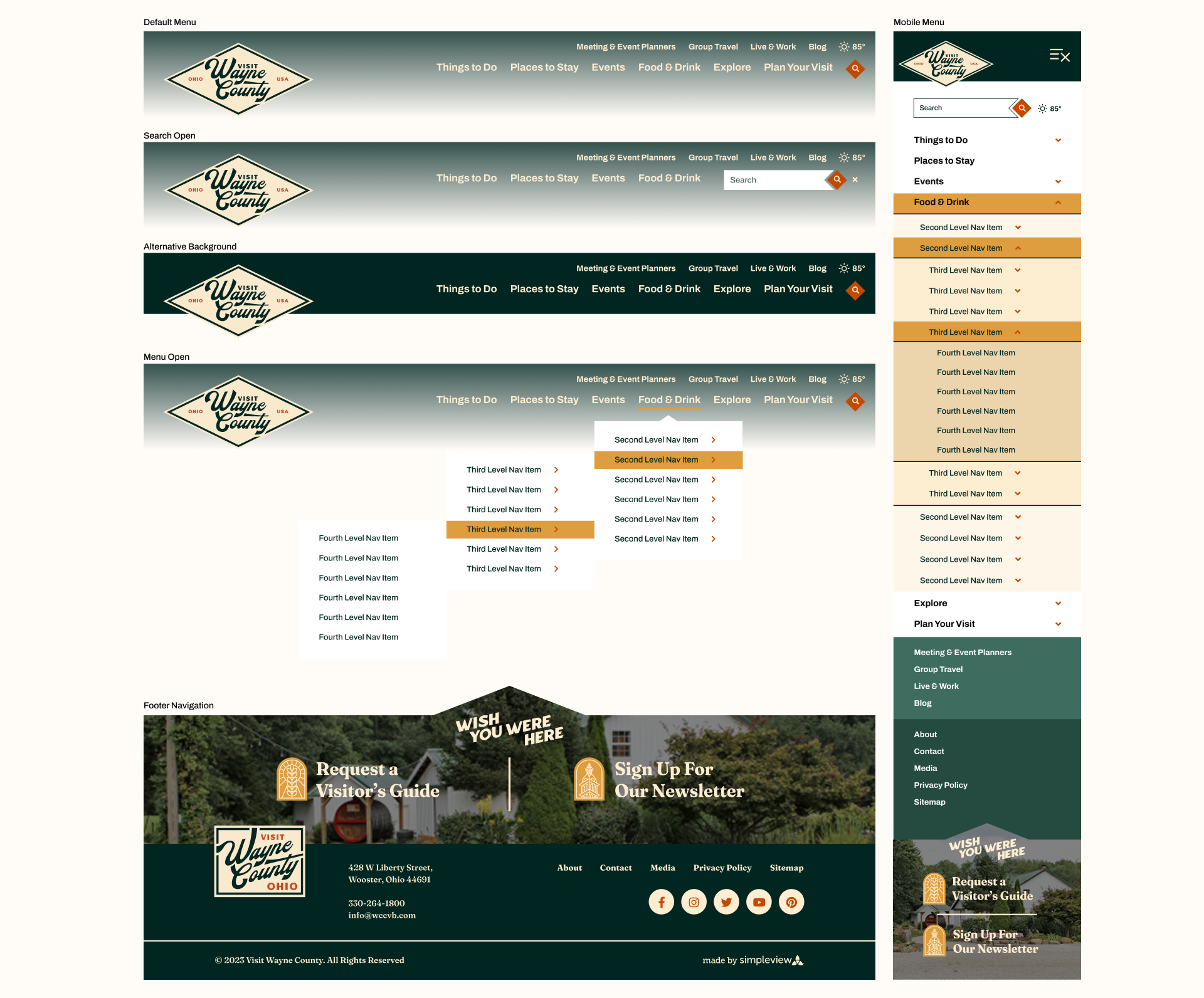
To ensure the site was flexible and user-friendly, I designed a full set of reusable button styles—primary, secondary, and tertiary—that could scale across different content types. The diamond badge shape from the visual identity was woven into the interface, adding brand consistency and a distinctive visual language.
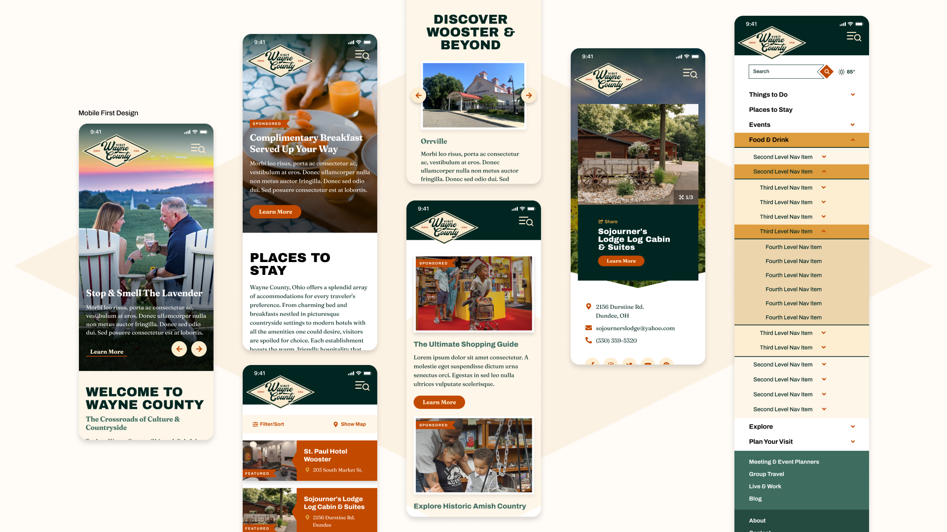
Highlighting local partnerships and small businesses was a top client priority, so we created dedicated areas for hotels, restaurants, and partners. The visitor’s guide, a cornerstone of their yearly tourism efforts, is prominently featured throughout the site with multiple entry points for users to find it.
Given the client’s active blog and frequent community events, the design emphasizes fresh content and timely updates. We made it easy for both locals and visitors to explore everything happening in Wayne County with clear navigation and event visibility.