Ray Ray's Sonoran Spirit Tea Branding & Packaging
Hard Tea Branding and Packaging for good friends, good spirits, and good friends in good spirits.
Agency
Freelance
Thanks to
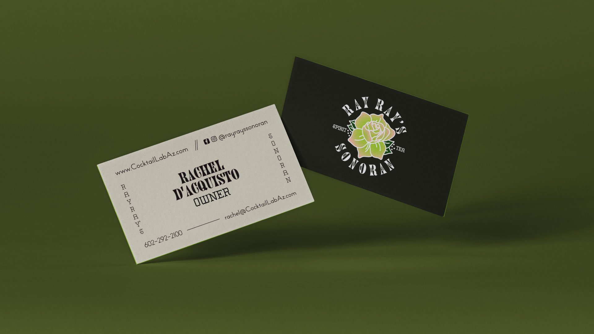
Rachel Dacquisto - Owner of Ray Ray’s
Role
Packaging Design
Scope
Packaging
Backstory
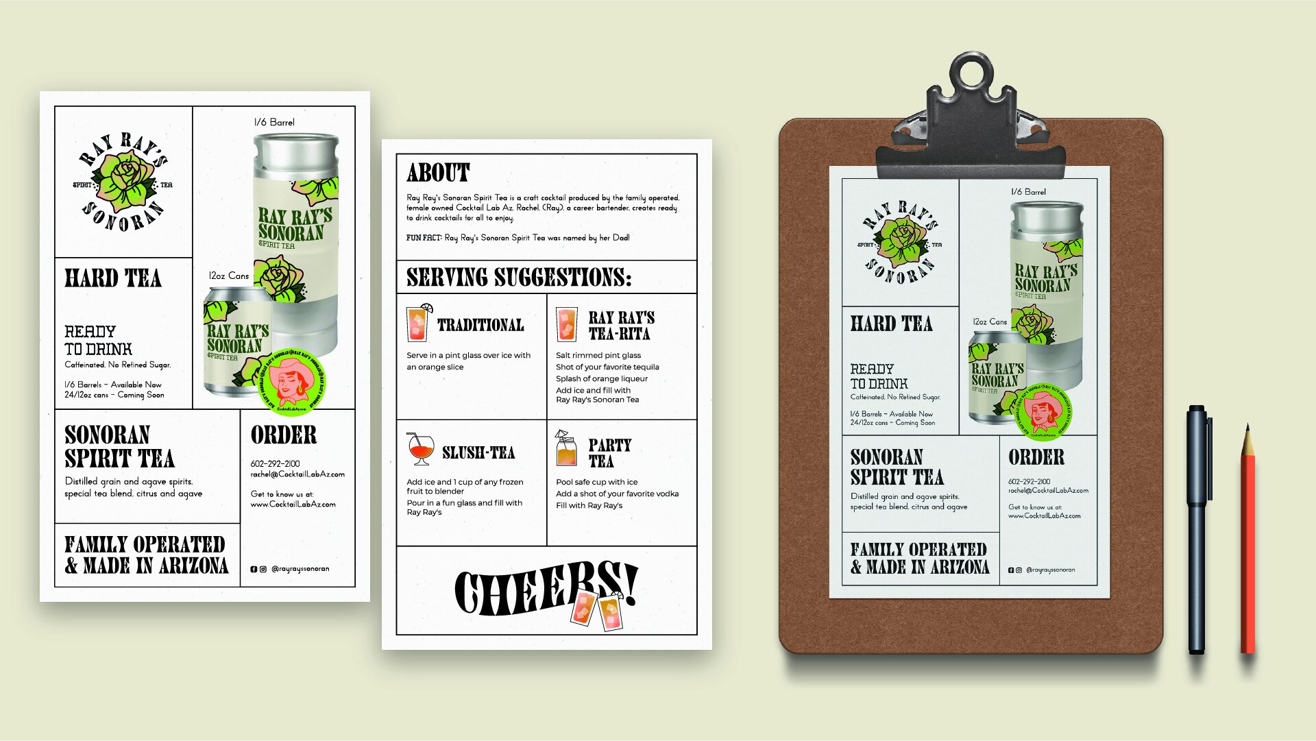
Rachel (Ray Ray) is a career bartender and the creative force behind Ray Ray’s, a line of canned cocktails crafted with a deep appreciation for flavor and the Southwest. The first in the lineup, Ray Ray’s Sonoran Spirit Tea, is a fresh take on a beloved Tucson classic. But before launching, Ray Ray’s needed a strong identity.
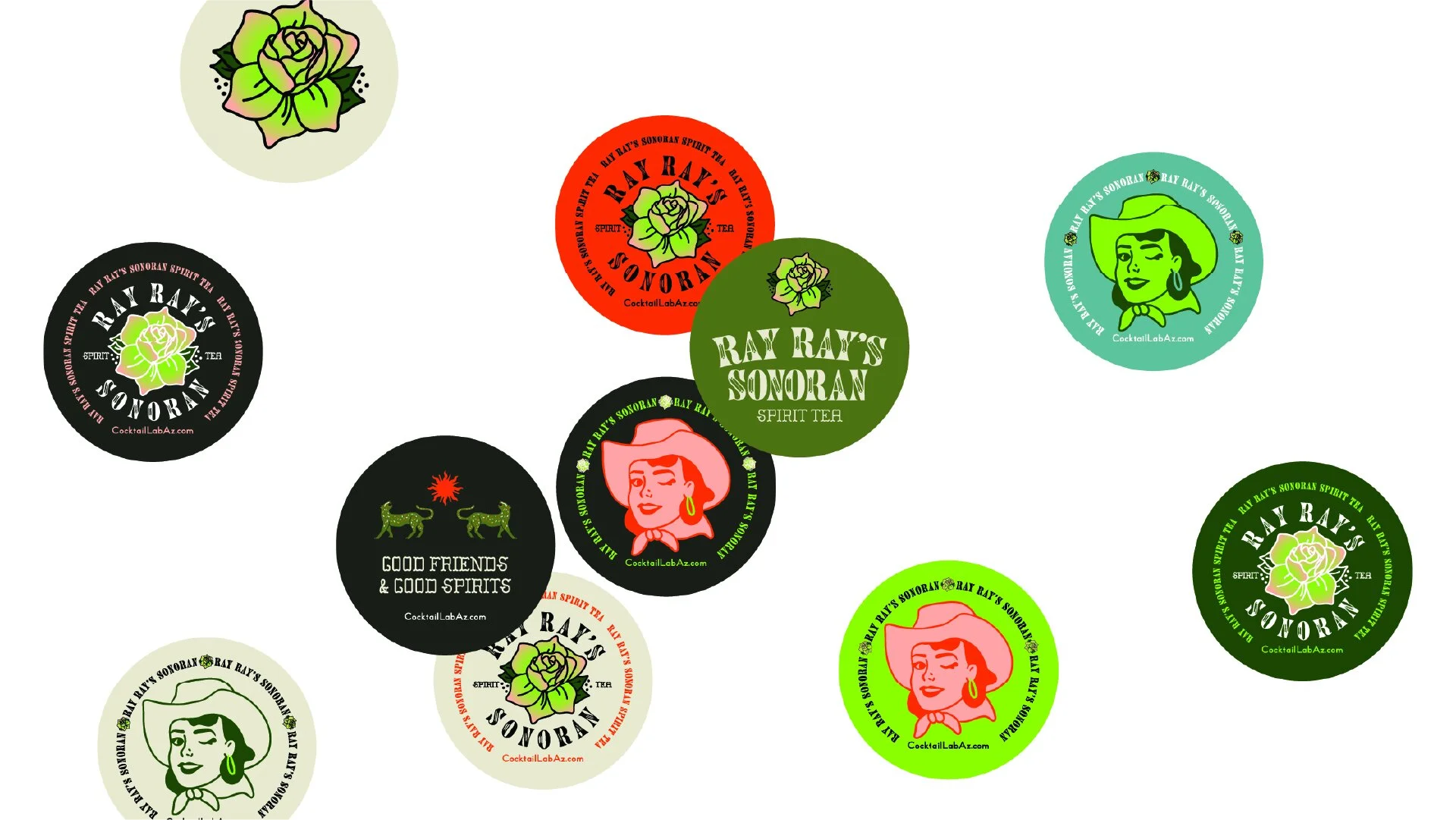
To develop the brand, I started with the most important question: What should this feel like? This wasn’t just about aesthetics—the flavor profiles needed to be clear! Through collaboration with Rachel, we defined Ray Ray’s as fun, joyful, clean, refreshing, and deeply rooted in the Southwest.
With the hard tea, seltzer, and low-ABV beverage industry booming, standing out from the big players is no small feat. Our approach? A visual identity inspired by the desert landscape and a graphic system built around a sketch Rachel provided. We struck a balance—neither rigid and structured like Madre Mezcal nor fully illustrative like Aura Bora. Instead, we landed right in the sweet spot: bold, vibrant, and unmistakably Ray Ray’s.
Look out, Budweiser—Ray Ray’s is here to shake things up.
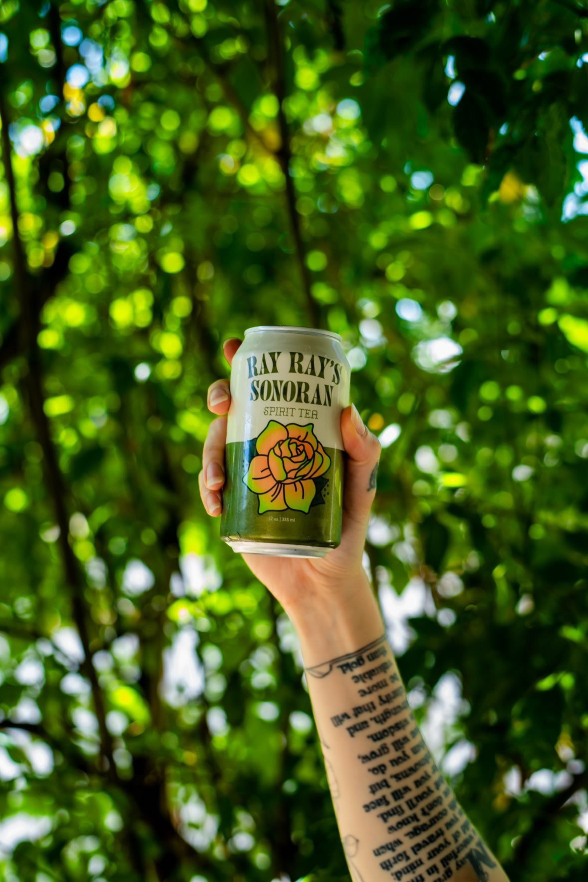
Photography Credit goes to Ryan Brownell | @ryanintucson


