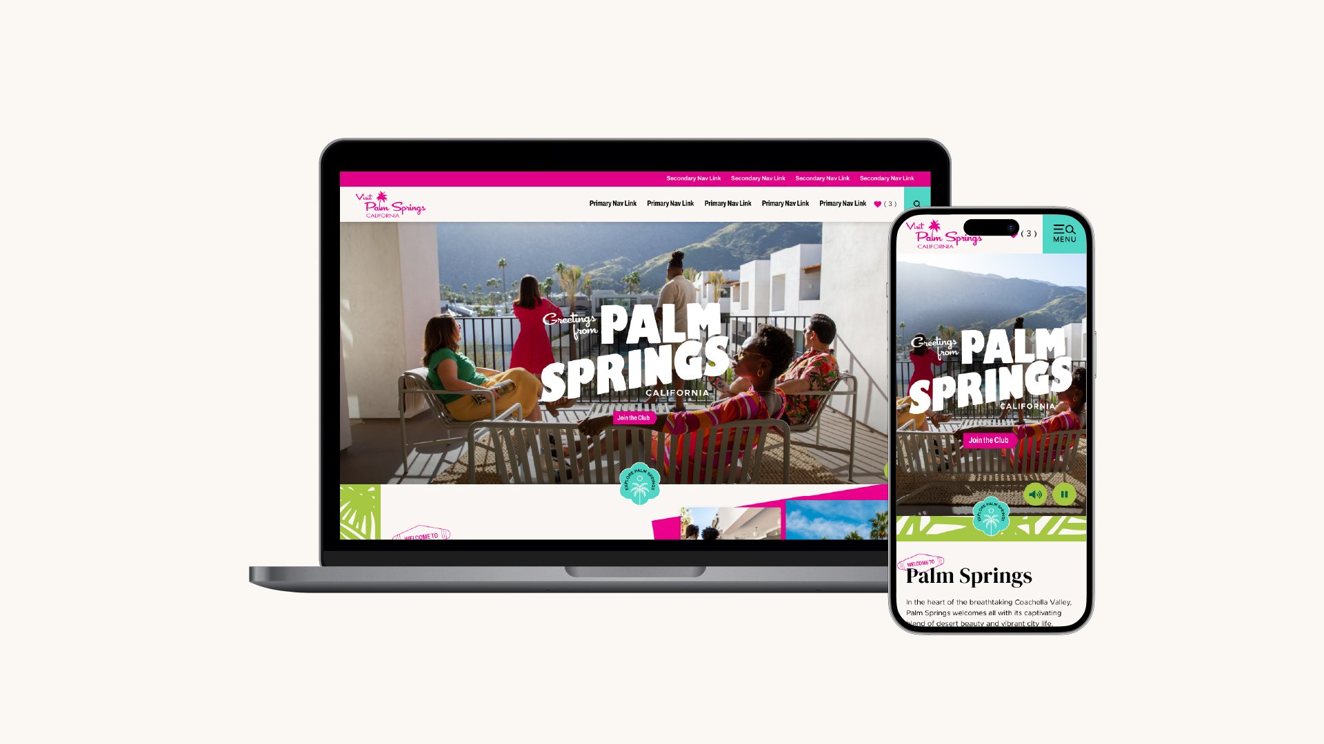
Visit Palm Springs Website Design
Bold, Local, & Inclusive: Palm Springs
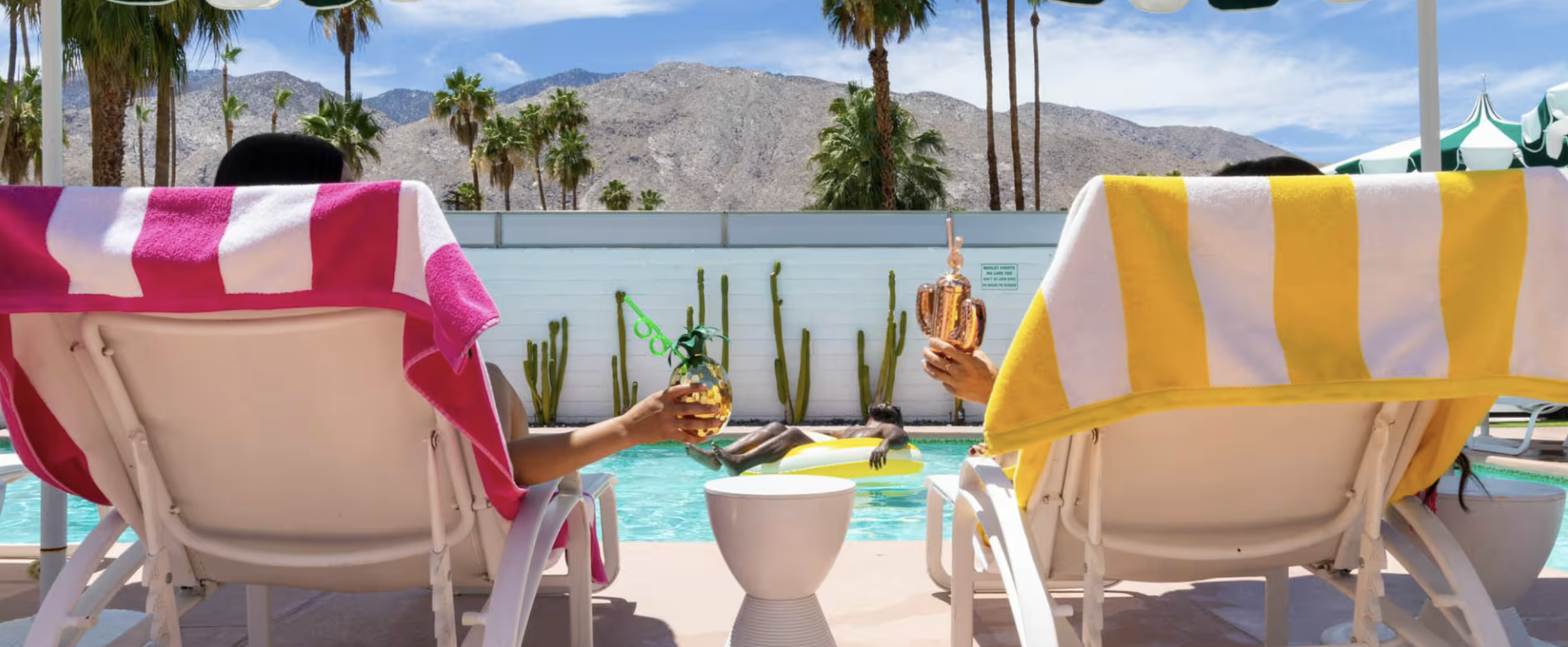
This project was a joy to design, as Palm Springs' iconic aesthetic provided a rich foundation to build upon. From its vibrant pool club culture and nightlife to its reputation as a premier LGBTQIA+ destination, the city’s iconic midcentury architecture and stunning desert surroundings offer something for everyone.
In addition to the website, I created a suite of assets for the Visit Palm Springs team to seamlessly integrate into their existing brand, enhancing the overall consistency and appeal of their identity.
Agency
Simpleview
Role
UX Strategy & Website Design
Scope
Website Design
Project Design Process
1 | On-Site Visit & In-Depth Discovery Process
Collaborative Discovery Sessions with Client
Defining the personality, destination attributes, key performance indicators, and demographic targets
Competitive Analysis
2 | Responsive Website Design
Strategically designed the website to align with key performance indicators, including visitors guide requests, highlighting blog content, and pointing visitors and residents to their events calendar.
3 | Collaboration & Delivery
Collaborated closely with cross-functional teams, including development and customer success teams, to ensure the seamless implementation of design projects from concept to completion.
4 | Successful Launch
Delivered on time and under budget
Increased total account value by 20%, adding $227K in new contracts
Boosted annual recurring revenue to over $645K
The success of the redesign led to a request to redesign the Greater Palm Springs website, and sparked rebrand conversations with 8 additional neighboring cities


Project Goals
Establish Visit Palm Springs as a unique and independent destination, distinct from the broader Greater Palm Springs brand and neighboring Coachella Valley cities
Create a modern, editorial-style site that highlights local voices, community offerings, and the distinctive Palm Springs aesthetic
Integrate tools like TripBuilder, QuickView, and custom modules to support planning and drive engagement
Key Performance Indicators
Drive Visitors Guide requests through clear, repeated CTAs.
Increase member/partner referrals by showcasing local businesses and attractions as 1 in 4 jobs in Palm Springs is supported by tourism.
Highlight timely events and blog content for use as a tool by residents and visitors.
User Research Insights
Target audiences are drawn to outdoor and wellness experiences, cultural tourism, including museums, architecture, and local history, and LGBTQ+ travel, inclusivity being a core brand pillar.
Modernism Week, Greater Palm Springs Pride, Coachella, and local film festivals act as major draws to the area.
Palm Springs is an inclusive destination for everyone — not just luxury travelers.


Inspiration & Visual Direction
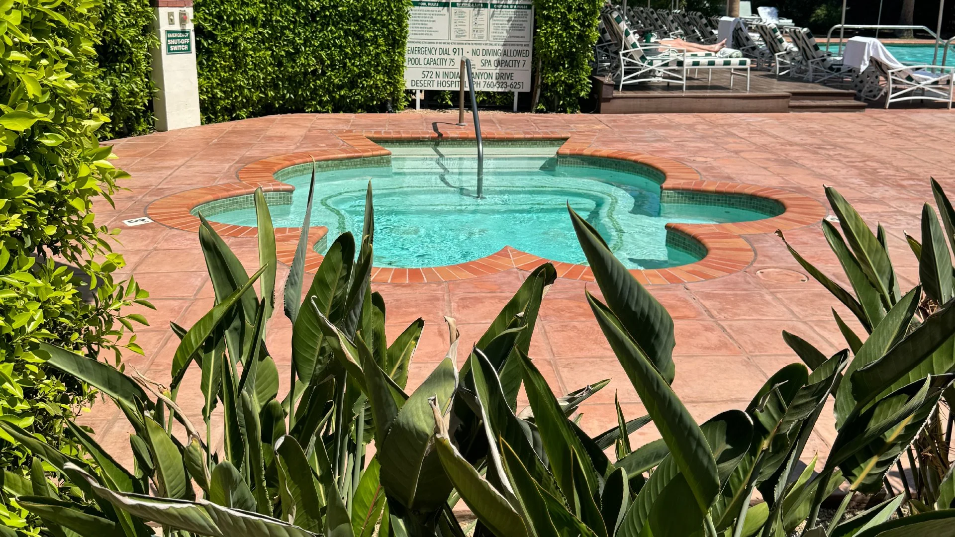
The design concept was inspired by the unique essence of Palm Springs itself. The city is renowned for its midcentury modern architecture, striking desert landscape, and the timeless glamour of Old Hollywood. I had the privilege of visiting Palm Springs to fully immerse myself in its aesthetic. Surrounded by boutique hotels, homes featuring iconic breezeblocks, slanted roofs, and the rugged beauty of desert plants, the visual direction quickly took shape.
That said, Palm Springs offers a range of personalities depending on the experience you’re seeking. For our clients, who described themselves as "the edgy little sister of Greater Palm Springs," I knew we could take a bolder approach. I leaned into this concept, incorporating bright colors, bold patterns, and midcentury modern design elements to reflect their vibrant, unconventional spirit. The result is a playful yet sophisticated take on Palm Springs that captures both its history and its modern energy.
Destination Personality & Style
Oasis in the Desert
Energetic
Trendsetters
Unique
Inclusive and welcoming
Midcentury & Old Hollywood Glam


TL;DR
I expanded upon the existing color palette to differentiate them from their DMO neighbor, Greater Palm Springs
Typography was chosen to reflect the midcentury design influences of Palm Springs
I designed a full suite of UI elements, including buttons, graphics, and patterns
Designed the website to show off their extensive suite of images and videos
Designed for key performance indicators, including local partnership features, an evergreen blog, and their events calendar
Color, Type & UI Elements
While Palm Springs already had an established color palette, I saw an opportunity to expand on it in a way that would set them apart from Greater Palm Springs, another DMO brand, which leans heavily into blue tones. To create a more distinct identity, I embraced bold pops of bright pink and neon green. To soften the intensity of these vibrant colors, I paired them with a warm cream and a deeper green, rounding out the palette with a more balanced, cohesive feel.
For typography, I selected a typeface that echoed many of the midcentury design influences I encountered during my research. The serif headers add a touch of sophistication, offering a refined contrast to the bold, edgy color scheme.
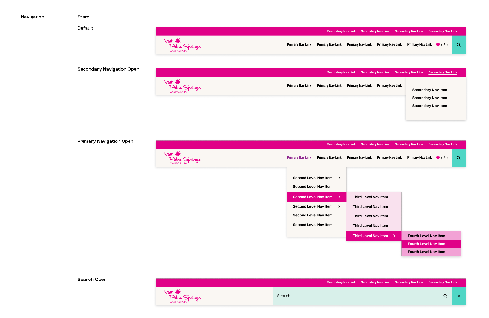
In addition, I designed a full suite of UI elements, including buttons, graphics, and patterns, ensuring a complete and cohesive user experience across all touchpoints.
Information Hierarchy
During Discovery, the client emphasized the importance of highlighting their strong connections with local businesses. To reflect this, I designed prominent sections on the homepage that showcase these partnerships, giving them attention while reinforcing Palm Springs’ community-driven spirit.
The client also wanted to feature their blog, which they update weekly with evergreen content, and local events. I created modular sections with large photo spaces to prominently display this content, ensuring high visibility for users. By prioritizing these on the homepage, we were able to drive users to the most important content, creating a journey through the exploration process in booking a trip.