Ongoing Visit Denver Website Redesign UX Process
This project is part of an ongoing initiative to improve the user experience of Visit Denver's website. Currently, I am in the beginnings of the UI phase, with plans to finalize the design by April 2025.
Visit Denver has many goals and pain points when it came to their current website. Through collaboration with the client, we were able to propose solutions for many of their problems, with more to come when we tackle the UI.
Agency
Simpleview
Thanks To
Eva Orduño
Art Director
Role
UX & UI Designer
Scope
UX, Digital Style Guide, & UI Library
Understand
The goal of this phase was to gather as much information as possible and establish a solid foundation for the project.
To achieve this, we held multiple discovery meetings with the client, where they shared their pain points, business goals, and an in-depth brand analysis conducted by an external company. Additionally, I performed my own website audit to identify any potential user pain points that may have been overlooked.
-
Too Much Text
Unclear Hierarchy of Information
Hard to Update on the Back End
-
Visit Denver had many business goals. These included switching to a storytelling feel on their website to guide the users through Denver’s offerings, utilizing the capabilities of Simpleview’s CMS by extensively tagging their content, and moving their focus toward interest based travel rather than season specific content.
-
Top Products
Dining Scene
Live Music Scene
Arts & Culture Scene
Proximity Between Outdoors & Urban Center
Year Round Events
Focuses
Family Activities
Food
Wellness
Arts / Culture
Music
Sports
Outdoor Rec / Adventure Light
Observe
The second phase of this project focused on thoroughly analyzing all the information we had gathered to uncover key insights and identify opportunities for improvement. This involved diving into the data shared by the client during our discovery meetings, including their outlined pain points and business goals, as well as reviewing the findings from the brand analysis.
In addition, the Simpleview team ran several reports to better understand how people were using the Visit Denver website. This included analyzing top-performing keyword searches, identifying the most visited pages over the last 12 and 24 months, and reviewing a Google Analytics report to map out the current user flow. Together, these efforts helped us pinpoint the elements driving traffic to the website and highlighted areas where the user experience could be improved.


Define Point of View
The goal of this phase was to use the data we collected to develop a clear understanding of the users and their needs. With the client’s top markets in mind, I created three user personas, aligning each with the destination’s offerings, market segments, and goals.
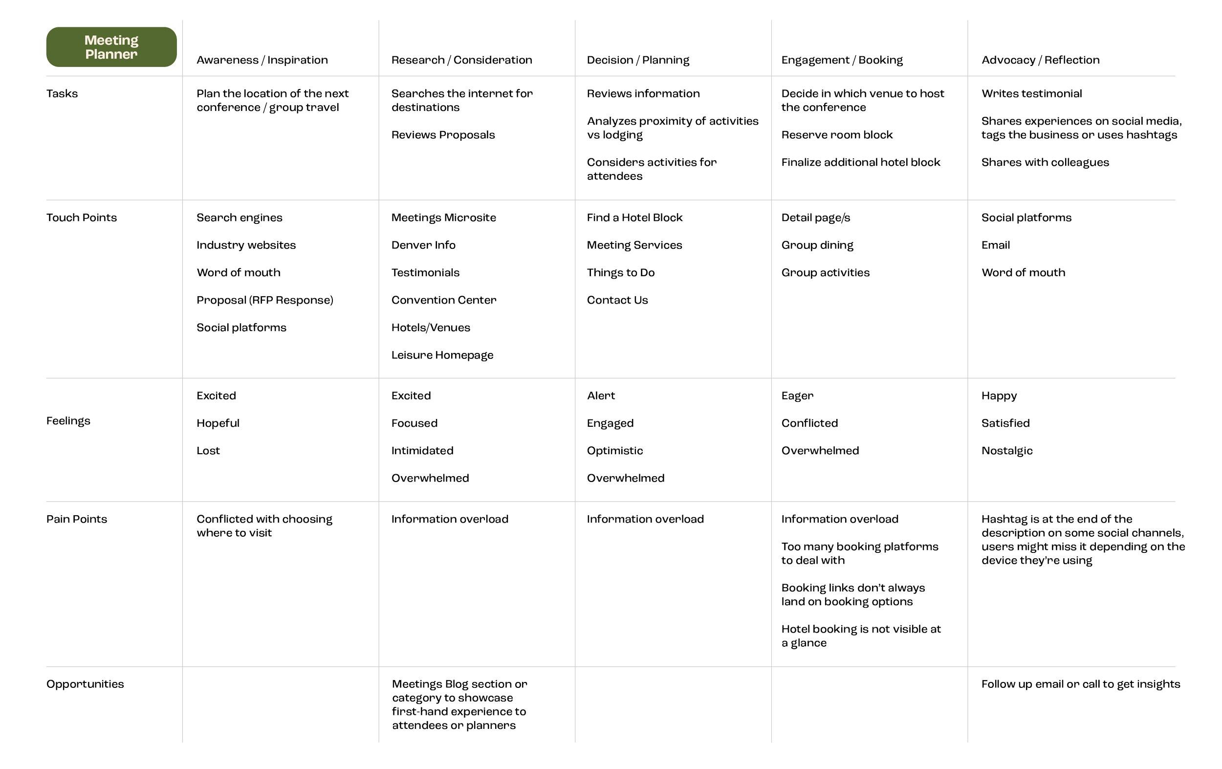
Next, I mapped out the most likely user journey for each persona, outlining their interactions with the Visit Denver website and identifying key pain points and opportunities for improvement. This phase established a strong foundation for developing user-centered solutions in the next stage of the project.


Ideate
Now for my favorite part of the process—bringing everything together. In this stage, I focused on defining what users would be looking for on each page. The client was passionate about using a storytelling approach for the information hierarchy, aiming to guide users through a narrative as they explored the website. Given the many ways a user could enter the site, this was no small challenge.
To tackle this, I considered how I might personally experience each key page as part of a story. My overall strategy was to use a funnel approach, starting broad and gradually narrowing down to more specific details. This ensured we could capture the attention of users unfamiliar with Denver who were searching for the city’s unique "distinguishing factor." I wanted to build excitement through large, inspirational imagery, make a strong case for Denver, and drive users toward action. By the time they reached the bottom of a page, the goal was for them to feel compelled to continue exploring.
For users already familiar with Denver, I prioritized placing the most important CTAs right at the top. This allowed them to skip the storytelling and quickly access what they needed without unnecessary steps.
Prototypes
The Prototypes phase was all about bringing the ideas to life in a tangible way. Using the information hierarchy developed during the ideation phase, I created wireframes for the key pages of the Visit Denver website. These wireframes served as a blueprint, focusing on layout, navigation, and the placement of content without the distraction of final visuals. I paid special attention to balancing the storytelling elements with clear calls to action, ensuring the design would engage both new and familiar users. Each wireframe was designed with user needs and goals in mind, prioritizing usability and flow while aligning with the client’s vision. These prototypes were the first step in testing and refining the design before moving into the final stages of the project.


